Sunday, August 29, 2010

Some old work I transferred from my other blog

A sampling of various pieces of calligraphy I've done in the past. Check back periodically for new uploads. Also see www.picturetrail.com/letterlady for more.

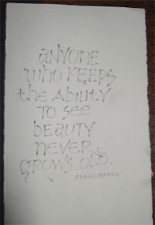
Here's a Franz Kafka quote lettered in pressurized graphite pencil.


A practice quote.


I did this one as a gift last Christmas.


A Mother Teresa quote.


A letterhead I created.


A contemporary uncial style.


This was a gift for a friend. The Credo "I believe" in her native language.


A wedding invitation that was fun to do. Two were totally hand-lettered, as was the original for the remaining ones whose recipients' names were individually scribed on them. Following this is the monogram I designed for the couple.


Goethe quote on a digitally altered background.


An invitation and the envelopes I lettered for a lovely bride.


Tiffany envelopes

I was surprised to open the Fed Ex package from my current wedding assignment. Inside were two lovely Tiffany boxes - that unmistakable aqua blue was exciting to see. I didn't know Tiffany did stationery. Yes, I live under a rock.

I'm not sure how well they take ink because I'm using a specially blended gray ink and it's a bit difficult to work with. Here are two photos - just because I like the boxes so much, and because I think the gray is looking pretty good.


Saturday, August 28, 2010

Mixed grey ink on Tiffany envelopes


I'm not sure if I can 'blame' the envelopes - I think it's mostly the ink mixture - but I'm finding these envelopes very slow going. First, I had to mix ink (I tried to use inks instead of gouache because I didn't think I'd need much.) I had ordered a special bottle of ink and thought I'd use that for the bulk of these. The ink did not come in, so I canceled the order. In addition, to get the right color I mixed up more than I'd expected to need. (Dr. Martin's white, Moon Palace black and for a touch of brown, walnut ink.) So - I have a lot of ink, it's the right color and it works passably well. Another issue is the letter style. It's not a true calligraphy style. It is a font - Rook. I thought I hated it, but it's actually looking much more graceful than I'd expected. And what a luxury! These envelopes are a generous size so the addresses look uncrowded, adding to the gracefulness. I don't think a layman could see how I've struggled with the ink and the 'font'. Lots of re-stroking has been required, but I like them. I have a lot to do in a short time. I will be sidelined for a medical procedure for two days, and I babysat for a few hours today. Hurry, hurry! They will be done on time, but it will be nose-to-the-grindstone when I am able.

Wednesday, August 25, 2010

A bit of recent work

These are a couple of drawings I did when I needed to feel creative. Just practice pieces using pressure/release lettering with pencil.

Another pressure/release with pencil exercise. I love doing these letters and plan to incorporate them into a large canvas piece as soon as I have time to play.

Play I did one Sunday afternoon this summer with my beautiful niece Celeste. It was fun suggesting things for her to try as she created her very first painting on canvas. It's very large, and she did a fantastic job!


This blog is about calligraphy!


I keep forgetting that I created a new blog to house my calligraphy ! My original blog http://www.janhurst.blogspot.com/, which was meant to be multi-purpose, housed calligraphy, other arts and much family news. Because of my new grandson, it has become majorly about him - and why not? Jace the Face is fantastic!

This is the blog I will be promoting for art and calligraphy from now on. If I remember. I'll try to remember.

I am working full time in a publishing company and come home at night to a lot of calligraphy work. I am simultaneously working on bits of three different weddings right now. It's been a very busy year, art-wise. I'll see if I can link this site to my other blog's calligraphy and art-related posts.


Above are photos of the Indian envelopes I've been working on. They are lush, but the heavy texture eats nibs. Fun to do anyway because they're so pretty.